Gifted Puma 2026 pinned «TABLE OF CONTENTS ——— Folders Update — Telegram Desktop BEFORE: • Main Screen • Edit Folder AFTER: • Main Screen - Default • Main Screen - Chats Drag & Drop • Main Screen - Folder Preview • Main Screen - Edit Folder ——— Stars Improvements — iOS BEFORE:…»
Channel Public Channel
 GI
GI Gifted Puma 2026
@giftedpuma2026
- Subscribers
- 33
- Photos
- 10
- Videos
- 0
- Links
- 1
Recent Posts 9 shown
Post #22
1.15K


AFTER:
Stars Improvements — Gift Stars & Get Stars
Userflow:
Gift Stars - 2 taps (Starting from Chat)
Design:
1. Stars are now added as a tab inside the attachments menu. This makes the user flow much simpler. The new placement fits the way users already think about sending content and removes the need to look through unrelated screens.
2. The space between the cards is now reduced. This makes the cards feel like one connected group. More cards fit on the screen at the same time.
3. The text inside the cards is now aligned to the left.
Stars Improvements — Gift Stars & Get Stars
Userflow:
Gift Stars - 2 taps (Starting from Chat)
Attach → Stars → [Select and pay]Design:
1. Stars are now added as a tab inside the attachments menu. This makes the user flow much simpler. The new placement fits the way users already think about sending content and removes the need to look through unrelated screens.
2. The space between the cards is now reduced. This makes the cards feel like one connected group. More cards fit on the screen at the same time.
3. The text inside the cards is now aligned to the left.
- ❤ 2
Post #20
903

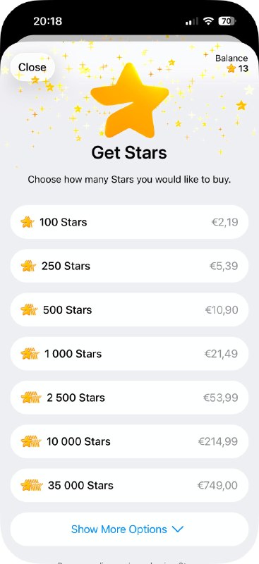
BEFORE:
Stars Improvements — Gift Stars & Get Stars
Userflow:
Gift Stars - 5 taps (Starting from Chat)
Design:
1. The place where users find the stars for gifts is hard to reach and not intuitive. Users have to open several screens that are not related to gifts, which makes the feature hard to discover.
2. The text inside the cards is not aligned to one line. Aligned text helps the eye move smoothly across the row
3. The space between the cards is too large. Reducing the gap would make better use of the screen space.
Stars Improvements — Gift Stars & Get Stars
Userflow:
Gift Stars - 5 taps (Starting from Chat)
Back → Settings → My Stars → Gift Stars to Friend → Select Friend → [Select and pay]Design:
1. The place where users find the stars for gifts is hard to reach and not intuitive. Users have to open several screens that are not related to gifts, which makes the feature hard to discover.
2. The text inside the cards is not aligned to one line. Aligned text helps the eye move smoothly across the row
3. The space between the cards is too large. Reducing the gap would make better use of the screen space.
- ❤ 2
Post #19
659
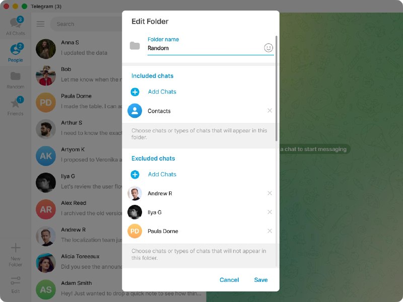
AFTER:
Folders Update — Edit Folder
Design:
The folder icon was moved to the left side. This is now consistent with the "Topics", where the icon also sits on the left. The placement is also more logical, because the icon on the left works as a label that shows what the field is for.
Folders Update — Edit Folder
Design:
The folder icon was moved to the left side. This is now consistent with the "Topics", where the icon also sits on the left. The placement is also more logical, because the icon on the left works as a label that shows what the field is for.
Post #16
611
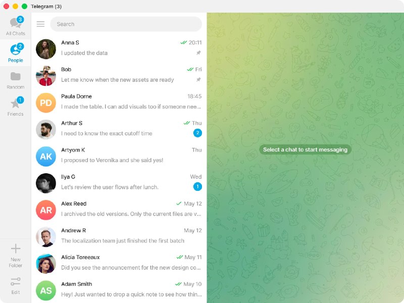
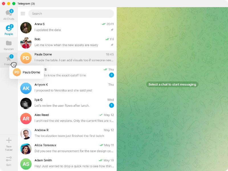

AFTER:
Folders Update — Main Screen
Userflows:
Create Folder - 2 clicks
Add Chats to Folder - 1 click
View Included Chats - 0 clicks
Design:
1. The folders now have a light background. It gives full focus to the conversations.
2. The Edit button is moved to the bottom of the panel. This separates folders from the actions. It makes the panel cleaner and easier to read.
3. A "New Folder" button is added to the panel. This gives users a direct way to create a folder in a few clicks.
4. The burger menu is moved to the left side of the search bar. This makes it clear that the menu belongs to the whole app and not to the folders panel.
Folders Update — Main Screen
Userflows:
Create Folder - 2 clicks
New Folder → [Name, Chats, etc.] → CreateAdd Chats to Folder - 1 click
Just Drag & DropView Included Chats - 0 clicks
Just HoverDesign:
1. The folders now have a light background. It gives full focus to the conversations.
2. The Edit button is moved to the bottom of the panel. This separates folders from the actions. It makes the panel cleaner and easier to read.
3. A "New Folder" button is added to the panel. This gives users a direct way to create a folder in a few clicks.
4. The burger menu is moved to the left side of the search bar. This makes it clear that the menu belongs to the whole app and not to the folders panel.
- ❤ 2
Post #15
437
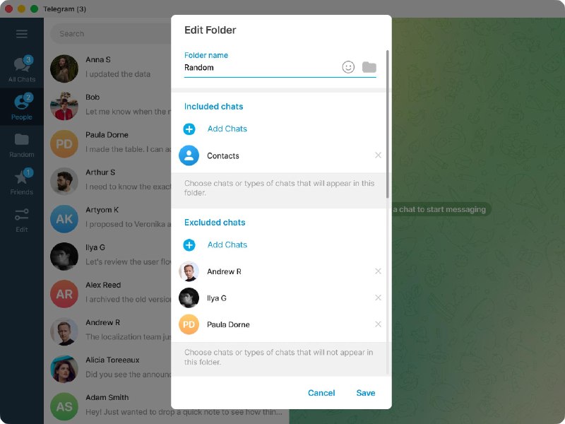
BEFORE:
Folders Update — Edit Folder
Design:
The folder icon on the right is used to change the folder icon. In 'Topics', the icon that represents the field is placed on the left, so users might expect to find it there. When the folder icon sits next to the emoji button, users see it as another action and miss its real purpose.
Folders Update — Edit Folder
Design:
The folder icon on the right is used to change the folder icon. In 'Topics', the icon that represents the field is placed on the left, so users might expect to find it there. When the folder icon sits next to the emoji button, users see it as another action and miss its real purpose.
Post #14
400

BEFORE:
Folders Update — Main Screen
Userflows:
1. Create Folder - 4 clicks
2. Add Chats to Folder - 6 clicks
3. View Included Chats - 4 clicks
Design:
1. The dark background of the folders takes too much attention. Right now the eye lands on the folders first, even though they are not the main content.
2. The burger menu icon is placed inside the folders panel. This creates a false impression that the menu belongs to the folders. In reality it opens the side menu of the whole app, so its current position can confuse users.
Folders Update — Main Screen
Userflows:
1. Create Folder - 4 clicks
Edit → Create New Folder → [Name, Chats, etc.] → Create → Close2. Add Chats to Folder - 6 clicks
Edit → Select Folder → Add Chats → [Select Chats] → Save → Save → Close3. View Included Chats - 4 clicks
Edit → Select Folder → [Viewing Chats] → Save → CloseDesign:
1. The dark background of the folders takes too much attention. Right now the eye lands on the folders first, even though they are not the main content.
2. The burger menu icon is placed inside the folders panel. This creates a false impression that the menu belongs to the folders. In reality it opens the side menu of the whole app, so its current position can confuse users.
Post #13
206
TABLE OF CONTENTS
———
Folders Update — Telegram Desktop
BEFORE:
• Main Screen
• Edit Folder
AFTER:
• Main Screen - Default
• Main Screen - Chats Drag & Drop
• Main Screen - Folder Preview
• Main Screen - Edit Folder
———
Stars Improvements — iOS
BEFORE:
• Gift Stars
• Get Stars
AFTER:
• Gift Stars - Attachment
• Get Stars
———
Folders Update — Telegram Desktop
BEFORE:
• Main Screen
• Edit Folder
AFTER:
• Main Screen - Default
• Main Screen - Chats Drag & Drop
• Main Screen - Folder Preview
• Main Screen - Edit Folder
———
Stars Improvements — iOS
BEFORE:
• Gift Stars
• Get Stars
AFTER:
• Gift Stars - Attachment
• Get Stars
- 👍 1
Channel created
About this channel
- How can I read @giftedpuma2026 without a Telegram account?
- TGViewer shows the public web preview Telegram publishes for Gifted Puma 2026: recent posts, photos, videos and the subscriber count, with no app, login or account.
- How many subscribers does Gifted Puma 2026 have?
- Gifted Puma 2026 (@giftedpuma2026) has 33 subscribers on Telegram, refreshed roughly every 30 minutes.
- Does Gifted Puma 2026 know I viewed it here?
- No. Public channel previews carry no viewer identity, and TGViewer has no accounts or tracking of what you look up.