
Viju is a streaming service. We designed its interface.
The main problem: users spend too much time choosing what to watch. They scroll, get tired, and leave. Not because the content is bad, but because the interface doesn't help.
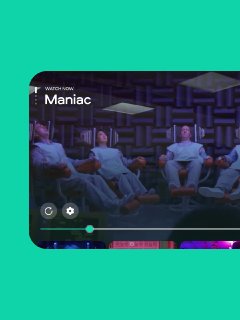
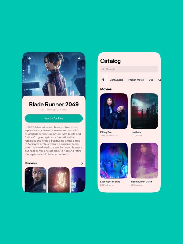
Together with the product team, we decided to try an unconventional approach. Instead of standard genres – short looped video fragments of films, which we called "kinoms". In a couple of seconds, viewers grasp the atmosphere and decide whether they want to watch. No spoilers.
These fragments can be used to create playlists not by genre but by emotion. For example, "Autumn and rain outside the window". This makes it possible to connect films that are far apart in genre but fit a certain mood.
Before prototyping, we built functionality maps (mind maps) across three dimensions: the structure of sections, the UI/UX of those sections, and their information content. Then we created "gray" prototypes to test scenarios before starting design and development. This helped us drop complex or unimportant features early on.
We developed a unified design system: modular grids, typography, buttons, inputs, colors, dimensions. We took into account the specifics of each platform. For Smart TV – remote control navigation and its own guidelines. For mobile devices – differences across iOS and Android versions. For browsers – a separate mobile version, since that's where the main flow of advertising traffic comes from.
We tested with dozens of people who were already used to other streaming services. We implemented emotional tags, collected feedback, and prioritized the solutions.
If you need an interface that helps retain users instead of putting obstacles in their way – reach out. We'll tell you how we designed the design system for Viju and think about how we can help with your project.
More details on this case: https://evrone.com/cases/viasat-design
Post #715
231



- 👍 5
- 🔥 3
- 🎉 1