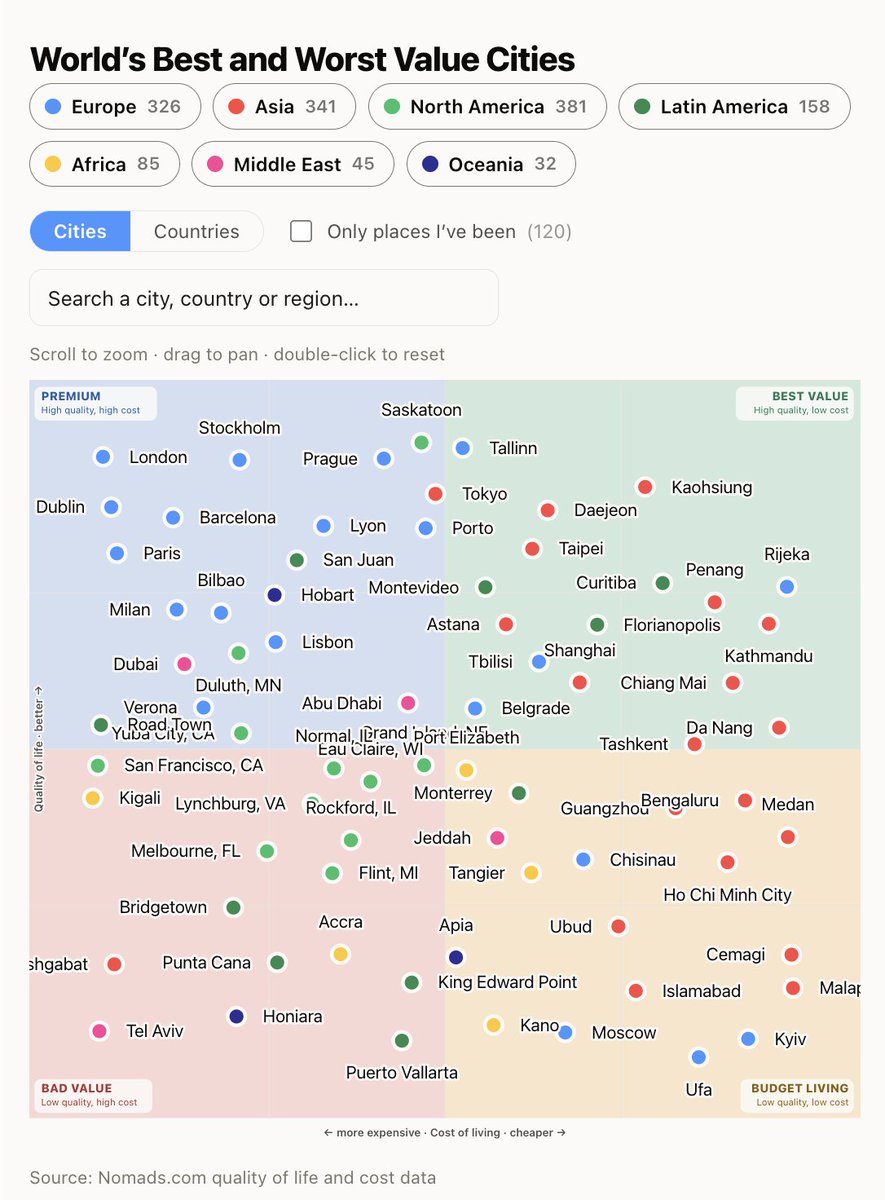
I liked this chart so much I had to recreate it
I flipped the axis so that top right is best (tip by @marckohlbrugge and @daniellockyer)
My chart is based on http://Nomads.com data, which for quality of life includes people actually liking the place, climate, healthcare, schools but also air quality
You can also select [ X ] Only places I've been and it checks your travel history and shows you those, in my case, I've barely been to places in the bottom left (high cost, low quality)
https://nomads.com/best-worst-value-cities
P.S. places at war get a reduced quality of life score on https://Nomads.com as they always have been, doesn't matter who started it, which is why Israel shows as low, without conflict it'd be in the top left (inb4 cancelled)
𝕏 @ThierryBorgeat: https://x.com/ThierryBorgeat/status/2088713999600746527
Here's places I've been mapped
So I barely been to bad value places, except SF!
Read on levels.io →
Post #2858
521