TGViewer
Channel Public Channel
Чувствительность к регистру

Чувствительность к регистру

@case_sensitivity

Шрифт и типографика, графический дизайн.
Subscribers
1.04K
Photos
2.5K
Videos
29
Links
663

Showing posts older than #1978 · Back to latest

Older Posts 14 shown
Post #1977 667
Прекрасный образец шрифта стиля mis-serif. 😊

#typedesign #logico
  • ❤ 12
Post #1976 1.17K
The font’s name is Gorton

Эта картинка — анонс развернутого и богато иллюстрированного рассказа про историю шрифта Гортон. Прекрасное.

#typedesign #wow
  • ❤‍🔥 9
  • ❤ 3
Post #1973 682
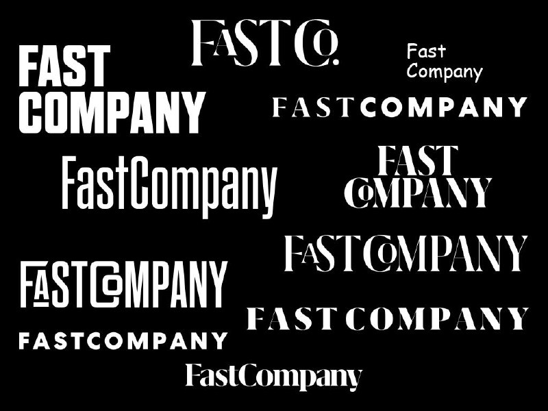
Fast Company Magazine Logo
by Mike Schnaidt and Rui Abreu

I chose to create a fresh logo using the versatile Grifo type family. I love how it’s thin areas feel sophisticated, yet it’s serifs are daring. I set the logo in Grifito, the more condensed version, and the small cap A and O in the wider Grifo. From there, I asked for some adjustments to harken back to the old Fast Company logo, and the type designer Rui Abreu modified all of the letterforms to be more harmonious.

#logo #editorial
  • ❤ 2
  • 🔥 2
Post #1972 561
Typeface
by workroom

Довольно логично, на первый взгляд. Пропорции знаков определяются геометрией и желаниями автора получить особую выразительность в наборе.

🎬———>> wwwwwwww

#typedesign #logico #custom #typeface
  • ❤‍🔥 2
  • ❤ 2
Post #1971 558
Kaleidoscope

#magcover
  • ❤ 3
Post #1967 463
Barneys New York Magazine Men’s Spring 2016
(_Edward_Leida_)

❤️🔼🖤🔝

#magcover #editorial
  • ❤ 4
  • 🔥 2
Post #1966 421
Barneys New York Magazine Women’s Spring 2016 (_Edward_Leida_)

#magcover
  • ❤ 1
Post #1965 393
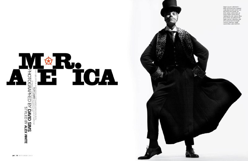
W Magazine
Edward Leida

Подскочило и отскочило. Экономно.

#editorial #typography
  • ❤ 4
  • 🔥 2
Post #1964 422
Джарвис, зажатый между лого и текстом. Три слоя—глубина на плоскости.

#ttypography #trick #magcover
  • ❤ 8
  • 🔥 4
Post #1963 399
Siniolchu
by Cosydesign

Компания, которая управляет рестораном.
Названа в честь горы Шиниолчу, которая, как говорят, является самой красивой горой в мире.

🗻——>>>>> wwwww

#logo #japan
  • ❤ 2
  • 🔥 2
Post #1962 419
The 1993 conference HOW Magazine
by Carlos Segura

In one respect it was groundbreaking: the first How Conference collateral campaign — ads, cards, a notebook cover, etc. — to be fully computer-generated. On a Mac IIci, to be precise, using Quark, Illustrator, and Photoshop. “We encountered many technical issues, all of which sound silly now, since everything is done this way. But back then it seemed everything was going wrong. We finally got it together and made it happen.

“By the way, the typeface designed for this event — called Neo — went on to become one of the first fonts we released via t26.com,” tells Segura

#typography #old_good_things #typedesign
  • ❤ 8
  • 🔥 1
Post #1961 383
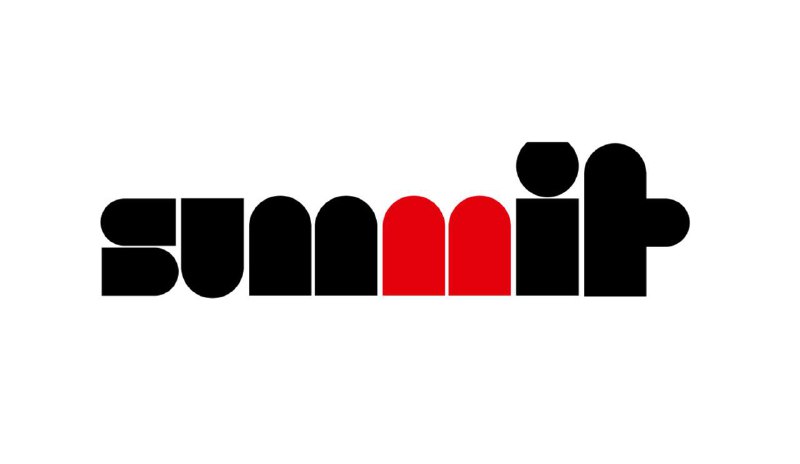
Summit Restaurant • 1968
Australia

Сочетание «негатива» и «позитива» в построении знаков логотипа.

#logo #trick
  • ❤‍🔥 7
  • 👍 1
Post #1960 406
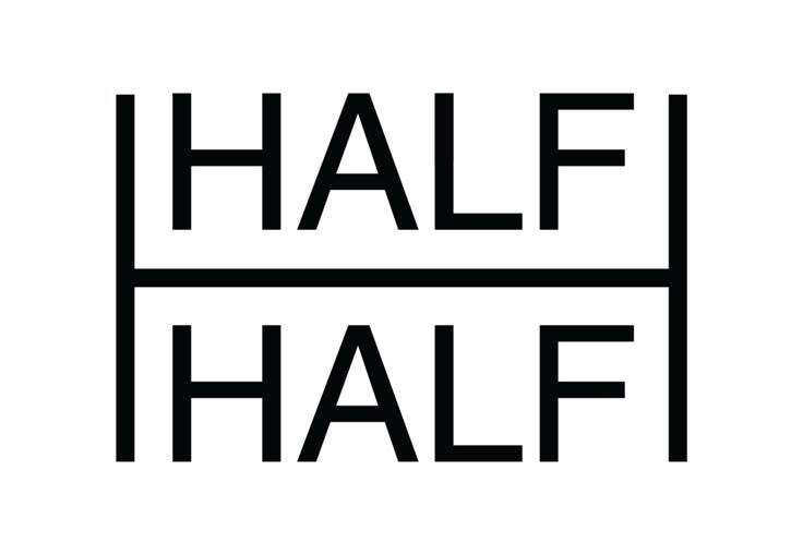
HALF&HALF Gzhel Plates
2017

That was a redesign of classic Gzhel Porcelain Ceramics by then a designer and now art-director of Strelka Institute - Anna Kulachek.

#trick #identity
  • ❤ 8
  • 🤔 2
  • 👍 1
Post #1958 377
На «Н» начинается, а дальше — как пойдет.

#logo
  • ❤ 5
  • 👍 2
Older posts →
Threads Profile ViewerView any public Threads profile without an account.Open ThreadLook →Writing with AI? Make it sound human.Metric37 rewrites AI drafts so they read naturally. Free AI detector, 1,500 words free.Try Metric37 →