
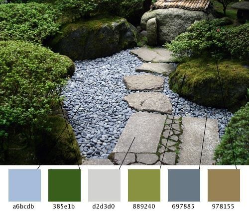
#ColorPalette of Japanese Zen aesthetic.
A Japanese Zen aesthetic color palette features soft, nature-inspired neutrals paired with subtle, earthy accents. It typically includes warm beiges, soft off-whites, stone grays, and muted greens, accented with deep charcoal and occasional pops of persimmon.
- Soft Off-White & Ivory: Mimics the natural, diffused light of traditional Japanese shoji paper.
- Stone Gray & Greige: Inspired by raked sand, pebbles, and weathered rocks found in serene temple gardens like Kyoto's Ryoan-ji.
- Warm Beige & Sand: Brings warmth to the room while visually expanding smaller spaces to feel airy and inviting.
- Muted Green: Shades like moss, matcha, or bamboo tie the space to the outdoors.
- Charcoal & Muted Black: Used in Japandi and dark Zen interiors to anchor the room and provide depth without being harsh.
- Earthy Tones: Soft terracotta and clay colors provide organic warmth and a whisper of contrast.
Post #10643
8.9K


- ❤ 9