TGViewer
Channel Public Channel
тонкая шпация и неразрывный пробел

тонкая шпация и неразрывный пробел

@thinspace

Дайджест новинок. Шрифт. Публикую только то, что мне приглянулось.
Subscribers
505
Photos
336
Videos
2
Links
302

Showing posts older than #414 · Back to latest

Older Posts 14 shown
Post #413 270
14
May 2026
Type.today

Разнобразно. Даже слишком.

—
Fluxetype Collection
—
Никита Канарёв
—
Styles — 84

#display #sans #VF #text
  • ❤ 3
Post #412 302
13
May 2026
The Pyte Foundry

Под старину повторно 💫

Paying tribute to the stylistic diversity of the 19th century, the Pyte Foundry offered a weekly free-font every Monday of the year 2016. With its spontaneous manufacture and limited availability, these throw-ups served as a critical playground reflecting on the desire production mechanisms intrinsic to the inaccessibility of historical material.
The Pyte Legacy Library comprises a more considered and curated selection of these Display weirdos, completely overhauled and expanded from their initial versions.
__

Pyte Legacy
—
The Pyte Foundry
—
Styles — 6

#display #serif #trial
  • ❤ 3
Post #411 318
12
May 2026
Peregrin Studio®

Курсив 👀

Ashcroft® is loosely rooted in the British humanist tradition — “humanist” meaning letters with more warmth, movement, and hand-shaped character than a purely mechanical sans-serif, especially the more personal style of old London Underground posters and other public-facing display type at the time. You can feel traces of Gill and Albertus in that mix, but it is not trying to revive any one source. The aim was to bring those influences together into something new.
__

Ashcroft
—
Peregrin Studio
—
Styles — 16

#display #text #serif #trial
  • ❤ 4
Post #410 283
11
Mayl 2026
Lineto

Машинопись 📄
__

Electa
—
Luca Pellegrini
—
Styles — 9

#display #serif #mono #trial
  • ❤ 7
Post #409 308
Caslon Rounded
by Commercial Type

Чуть точнее, чем автор шрифта постом выше, про источник вдохновения:
“… the first rounded typeface was cut by the Caslon & Catherwood foundry in 1836…”
  • 🔥 2
Post #408 266
10
April 2026
Benjamin Tuttle (Future Fonts)

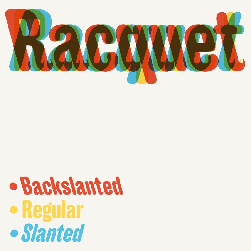
Два наклона на одно нормальное нечертание. Плюс росчерки и альтернативы.
__

Racquet is a rounded sans serif with display tendencies. It is a reinterpretation and amalgamation of a handful of historic European typefaces from the late 1800s

Racquet
—
Benjamin Tuttle
—
Styles — 3

#display #sans
  • ❤ 4
  • 🎉 1
Post #407 281
09
April 2026
MCKL

Множество оттенков узкого.
__

Atlantic takes inspiration from the original nameplate of The Atlantic’s first issues from 1857, researching the origin of the printer and type foundry involved in the original publication. This led us to specimens in the Scotch Roman genre with a uniquely American flavor.

Atlantic
—
Jeremy Mickel
With assistance from:
Marko Hrastovec
Douglas Hayes
—
Styles — 42

#display #serif
  • ❤ 4
Post #406 314
A2 Typeface ——>>>
Sorry, we don’t supply trial fonts anymore. We tried and found it unmanageable. Maybe you can use the type tester above? Download our font specimens or simply buy the fonts – your support will enable us to continue developing new fonts for everyone.
  • ❤ 3
Post #400 285
08
March 2026
Future Fonts

Кудряво получилось.

Superfluous
—
Daria Cohen
—
Styles — 1

#display #sans #VF
  • ❤ 5
Post #399 331
07
March 2026
CSTM Fonts and M59

Удвоения и петли (не обязательные, но есть).

It is an experimental narrow neo-geomanist sans that attempts to list all the ways you can skin a cat, if by skinning a cat you mean drawing letters the wROnG way

Diplosopher
—
Fabio Pop and Ilya Ruderman
—
Styles — 9

#display #text #sans #VF
  • 👍 3
  • ❤‍🔥 1
  • 🎉 1
Post #396 348
06
March 2026
Overtype

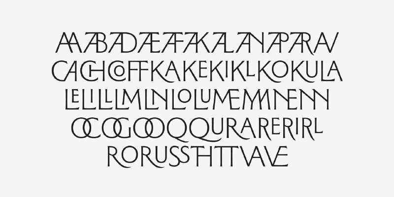
Множество разнообразных лигатур ❤️.

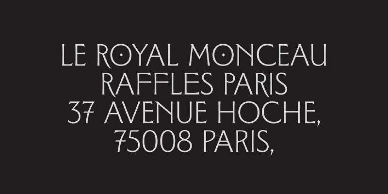
Demorny is a display typeface that explores the foundational tensions of “modernity.” Rooted in the early developments of Art Nouveau (to which Eugène Viollet-le-Duc contributed key structural principles), it engages with the cultural imagination of Belle Époque Paris, a moment of intense aesthetic and social effervescence. The typeface also pays tribute to Mathilde de Morny, a queer figure of the era.

Demorny
—
Tim Vanille, Inès Davodeau
—
Styles — 8

#display #serif #trial
  • 🔥 5
  • 😍 4
Post #392 291
Anker Medium Style
Commercial Type

Из далекого 2015 года.
—
Greg Gazdowicz
—

Originally drawn for the New York magazine Fall Fashion issue in 2015, inspired by storybook lettering from the early 20th century.

—
#display
  • ❤ 5
  • 👍 1
  • 🔥 1
Post #391 251
05
March 2026
HAL

Не новое, но сильно обновленное.

Зонировано всё, особенно время. Монотонность течения последнего отмечаем в первую очередь. Кириллица 👀 норм.

Timezone
—
HAL Typefaces
—
Styles — 18

#display #text #serif #trial
  • ❤ 2
  • 🎉 2
Older posts →
Threads Profile ViewerView any public Threads profile without an account.Open ThreadLook →Writing with AI? Make it sound human.Metric37 rewrites AI drafts so they read naturally. Free AI detector, 1,500 words free.Try Metric37 →