TGViewer
Html and Css & Jsآموزش Html and Css & Jsآموزش @htmlcss_channels · 23.1K subscribers
Post #2297 3.02K
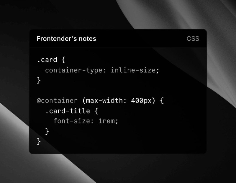
⭐️ Container Queries — a new way to make layouts responsive.

Before: @media rules reacted to screen width (e.g. under 768px → smaller font).
Problem: components behave differently in cards, sidebars, modals — viewport alone isn’t enough.

Container Queries let CSS adapt to a parent’s size, not the whole screen.

➡️ Example:

.card { container-type: inline-size; }

@container (max-width: 400px) {
.card-title { font-size: 1rem; }
}


How it works
• Mark a container with container-type.
• Use @container to style elements inside it.
• Components adapt to parent width, no global media hacks.
• Cleaner CSS, fewer JS tweaks, local responsive behavior.

📌 Supported natively in modern browsers — truly component-based CSS.


💎 @Htmlcss_channels | #css #JavaScript #HTML
  • ❤ 1
  • 🙏 1
More from @htmlcss_channels
  1. Sep 28, 2026🤖 خداحافظی با جستجوی خسته‌کننده منابع! اگه کار شما با گرافیک، تدوین یا هوش مصنوعی گره خور…
  2. Sep 28, 2026📚 آرشیو معتبرترین مجلات جهان 🆔 @EnglishMagazines_PDF ▪️▪️▪️▪️▪️▪️▪️▪️▪️ ⛳️ @Armisstab .
  3. Sep 28, 2026🤖 نسل جدید فیلترشکن‌های EASY2RAY با استفاده از هوش مصنوعی! 📱 اتصال بدون دردسر و بدون نیا…
  4. Sep 28, 2026؛CSS Clamp — اندازه‌گذاری هوشمند فرمول ساده ؛clamp(کمترین, مقدار_ایده‌آل, بیشترین) مثل یه…
  5. Sep 28, 2026🔅 CSS Clamp clamp(minimum, preferred, maximum); In this example, the preferred value is 5…
  6. Sep 26, 2026برای معرفی پروژه هاتون به کارفرما بهتره از این روش استفاده کنید این وبسایت پروژه هاتون رو…
Threads Profile ViewerView any public Threads profile without an account.Open ThreadLook →Writing with AI? Make it sound human.Metric37 rewrites AI drafts so they read naturally. Free AI detector, 1,500 words free.Try Metric37 →