TGViewer
Channel Public Channel
Data science/ML/AI

Data science/ML/AI

@datascience_bds

Data science and machine learning hub

Python, SQL, stats, ML, deep learning, projects, PDFs, roadmaps and AI resources.

For beginners, data scientists and ML engineers
πŸ‘‰ https://rebrand.ly/bigdatachannels

DMCA: @disclosure_bds
Contact: @mldatascientist
Subscribers
14K
Photos
609
Videos
7
Links
341

Showing posts older than #1205 Β· Back to latest

Older Posts 20 shown
Post #1204 1.83K
β–ŽHow to Enter Data Science

1. Master the Fundamentals
Begin with the foundational skills by learning programming languages like Python and R, which are essential for data analysis and machine learning. Familiarize yourself with key libraries and tools such as Pandas, NumPy, scikit-learn, and TensorFlow for machine learning, as well as Tableau and Matplotlib for data visualization. Online courses, tutorials, and coding bootcamps can provide structured learning paths.

2. Identify Your Niche
Data science spans various industries, including healthcare, finance, marketing, and technology. Explore these fields to determine where your interests lie. Understanding the specific challenges and data types in your chosen industry will help you tailor your learning and make you more effective in your future role.

3. Build a Strong Portfolio
Start working on small projects that demonstrate your skills and knowledge. These could include data analysis tasks, machine learning models, or visualizations based on publicly available datasets. Use platforms like GitHub to showcase your work, and consider writing blog posts or creating presentations to explain your projects. A well-rounded portfolio not only highlights your technical capabilities but also reflects your problem-solving approach.

4. Engage with the Community
Join data science communities online (like Kaggle, Stack Overflow, or LinkedIn groups) to connect with professionals in the field. Participating in discussions, attending webinars, and contributing to open-source projects can enhance your learning experience and expand your network.

5. Pursue Continuous Learning
Data science is an ever-evolving field, so staying updated with the latest trends, techniques, and tools is crucial. Follow relevant blogs, podcasts, and research papers. Consider pursuing advanced certifications or degrees to deepen your expertise.

6. Gain Practical Experience
Look for internships, volunteer opportunities, or part-time positions that allow you to apply your skills in real-world scenarios. Practical experience will not only reinforce your learning but also give you insights into the day-to-day responsibilities of a data scientist.

By following these steps, you can build a solid foundation in data science and position yourself for success in this dynamic and rewarding field.
  • ❀ 6
  • πŸ”₯ 2
Post #1203 1.65K
50 Data Science Project Ideas
  • ❀ 5
  • πŸ”₯ 1
Post #1202 1.82K
β–ŽCommon Machine Learning Terms

1. Algorithm: A set of rules or steps used to solve a problem or perform a task, particularly in the context of data processing and analysis.

2. Model: A mathematical representation of a real-world process, created by training an algorithm on data.

3. Training Data: The dataset used to train a machine learning model, consisting of input-output pairs.

4. Test Data: A separate dataset used to evaluate the performance of a trained model, ensuring it generalizes well to unseen data.

5. Overfitting: A modeling error that occurs when a model learns the training data too well, capturing noise along with the underlying pattern, leading to poor performance on new data.

6. Underfitting: A situation where a model is too simple to capture the underlying trend in the data, resulting in poor performance on both training and test datasets.

7. Feature: An individual measurable property or characteristic of the data used as input for a model.

8. Label: The output or target variable that a model aims to predict based on the input features.

9. Supervised Learning: A type of machine learning where the model is trained on labeled data, learning to map inputs to outputs.

10. Unsupervised Learning: A type of machine learning where the model is trained on unlabeled data, aiming to find patterns or groupings within the data.

11. Reinforcement Learning: A type of machine learning where an agent learns to make decisions by taking actions in an environment to maximize cumulative reward.

12. Hyperparameters: Configuration settings used to control the training process of a model, which are set before training begins.

13. Loss Function: A mathematical function that quantifies how well a model's predictions match the actual outcomes; used to guide the optimization process.

14. Gradient Descent: An optimization algorithm used to minimize the loss function by iteratively adjusting model parameters in the direction of the steepest descent.

15. Cross-Validation: A technique for assessing how the results of a model will generalize by dividing the dataset into multiple subsets and training/testing across them.

16. Confusion Matrix: A table used to evaluate the performance of a classification model by comparing predicted labels against actual labels.

17. Precision and Recall: Metrics used to evaluate classification models; precision measures the accuracy of positive predictions, while recall measures the ability to find all relevant instances.

18. ROC Curve (Receiver Operating Characteristic Curve): A graphical representation of a model's diagnostic ability across various threshold settings, plotting true positive rates against false positive rates.

19. Regularization: Techniques used to prevent overfitting by adding a penalty for complexity to the loss function (e.g., L1 and L2 regularization).

20. Ensemble Learning: Combining multiple models to improve overall performance; common methods include bagging, boosting, and stacking.
  • ❀ 3
  • πŸ”₯ 2
Post #1199 1.63K
What is an Agenetic AI?
  • πŸ‘ 5
  • ❀ 3
  • πŸŽ‰ 1
Post #1198 1.54K
🧠 The Statistical Illusion: Simpson’s Paradox 🎭

Imagine you are choosing a hospital for a surgery.
β€’ Hospital A has a higher survival rate than Hospital B for "Easy" cases.
β€’ Hospital A also has a higher survival rate for "Hard" cases.

Common sense says: Choose Hospital A. But when you look at the total combined data, Hospital B actually has a higher survival rate. 🀯

This is Simpson’s Paradox: A trend appears in several different groups but disappears or reverses when these groups are combined.


πŸ” Why does this happen?
It happens because of a Lurking Variable (a hidden factor). In this case, Hospital A is a world-class facility, so it takes on way more "Hard" cases than Hospital B. Even though they are better at both types, the high volume of risky surgeries drags their overall average down.


🐍 See the Paradox in Code
Let's simulate this "impossible" scenario using Python:

import pandas as pd

# Data: [Successes, Total Attempts]
data = {
'Hospital': ['A', 'A', 'B', 'B'],
'Case_Type': ['Easy', 'Hard', 'Easy', 'Hard'],
'Survived': [95, 10, 90, 70],
'Total': [100, 100, 100, 1000]
}
df = pd.DataFrame(data)

# 1. Check rates per group
df['Rate'] = df['Survived'] / df['Total']
print("--- Rates by Group ---")
print(df[['Hospital', 'Case_Type', 'Rate']])

# 2. Check overall rates
overall = df.groupby('Hospital').sum()
overall['Overall_Rate'] = overall['Survived'] / overall['Total']
print("\n--- Overall Rates (The Paradox!) ---")
print(overall['Overall_Rate'])


The Result:
β€’ A is better at Easy (95% vs 90%).
β€’ A is better at Hard (10% vs 7%).
β€’ BUT... Overall, B wins (14% vs 52%) because B mostly did "Easy" cases.


πŸ›  How to avoid being fooled?
1. Don't trust the aggregate: When analyzing data, always try to "segment" or "drill down" into sub-groups.
2. Look for the Weight: Ask yourself: "Is one group disproportionately represented in the total?"
3. Identify the Lurking Variable: What context is missing? (e.g., Age, Severity, Time of Day).


🎯 The Takeaway
In Data Science, the "Big Picture" can sometimes be a big lie. If your analysis produces a result that defies logic, you might be looking at a Simpson’s Paradox. Always slice your data before you trust it.
  • ❀ 7
Post #1197 1.56K
Programming, data science, ML - free courses by Big Data Specialist We’re live πŸš€ After 4 years of work, I finally launched: πŸ‘‰ learndevs.com Goal: one place for everything a developer needs (free courses, tech news, job offers, manually written blogs. best github repos etc) A lot of you contributed by writing code or adding…
Hey everyone πŸ‘‹

I know I promised to create a Data Science course. I was working on that late last year, but since early 2026 I’ve had some health issues, so they got postponed. I’ll get back to them as soon as I’m better πŸ™Œ

In the meantime, I launched this ☝️ today:

https://learndevs.com/

I started building this back in the 2020s, together with many of you.

It’s not perfect yet, but better to have it now than wait forever.

Would love your feedback ❀️
learnDevs LearnDevs: Programming Courses, Tech News, GitHub Repos & Remote Jobs Explore programming courses, coupons, tech news, curated GitHub repos, tutorials, and remote jobs, built for developers.
  • ❀ 8
Post #1196 1.29K

Forwarded from Programming, data science, ML - free courses by Big Data Specialist

We’re live πŸš€

After 4 years of work, I finally launched:

πŸ‘‰ learndevs.com

Goal: one place for everything a developer needs (free courses, tech news, job offers, manually written blogs. best github repos etc)


A lot of you contributed by writing code or adding courses and knowledge along the way.
This is as much yours as it is mine πŸ™Œ

And I’m already working on:
β€’ Personalized roadmaps
β€’ Live chat
β€’ Better job search & placement

Try it and please tell me:
What would you add next?

Reminder that if you want early access to new features, Join our beta testers group. Looking for people who will explore, break things, and share honest feedback.
  • πŸ”₯ 6
  • ❀ 1
Post #1194 1.36K
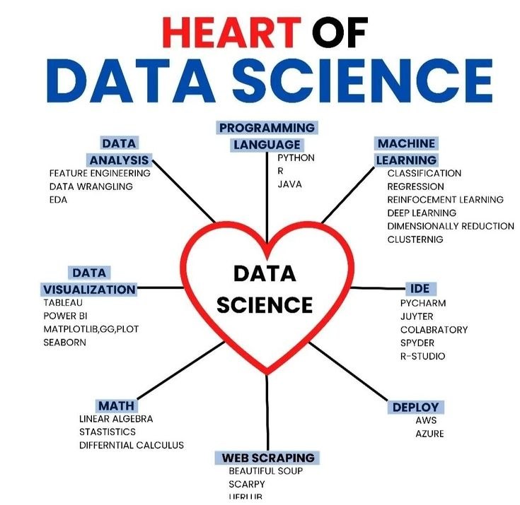
Heart of Data Science
  • ❀ 3
  • πŸ‘ 1
Post #1193 1.5K
πŸ—Ί The 5 W's of Data Visualization: Why, Who, What, When, Where

Creating a chart is easy. Creating a good chart, one that actually communicates an insight and isn't just a pretty picture, requires thinking like a detective. You need to answer the "5 W's" before you even pick a chart type.

Every great visualization tells a story, and you need to know the plot points.

πŸ€” 1. WHY: What is the Goal?
Before you draw anything, ask:
β€’ What question am I trying to answer? (e.g., "How do sales change over time?", "Which region performs best?")
β€’ What insight do I want the viewer to gain? (e.g., "Sales are growing rapidly," "Region X is underperforming.")
β€’ What decision will this chart help make? (e.g., "Should we invest more in Region Y?")

Your chart's purpose dictates everything from chart type to color choices.


πŸ‘₯ 2. WHO: Who is the Audience?
Consider who will be looking at your chart:
β€’ Technical Experts: Can handle complex plots, statistical jargon, and detailed axes.
β€’ Business Stakeholders: Need clear, high-level insights. Focus on the "so what?" Avoid jargon.
β€’ General Public: Keep it simple, use intuitive charts, and provide clear titles and labels.

A chart for an AI researcher is vastly different from one for a marketing team.


πŸ“Š 3. WHAT: What Data is Relevant?
β€’ What variables (columns) are needed? Don't include everything just because it's there.
β€’ What time frame or subset of data is required? (e.g., Q3 sales only, data for specific countries).
β€’ What are the units? ($, %, kg, units, etc.) – Crucial for labels!


⏰ 4. WHEN: When is the Data Important?
This is about the time or sequence of your data:
β€’ Trends over time? (Line charts, area charts)
β€’ Comparisons at a specific point? (Bar charts, pie charts - use sparingly!)
β€’ Distribution within a period? (Histograms, box plots)
β€’ Relationships at any time? (Scatter plots)

The "when" helps you choose the chart type that best shows change or static comparison.


πŸ—Ί 5. WHERE: Where Does the Data Live?
β€’ Geographical Data: If your data is tied to locations (countries, states, cities), use maps!
β€’ Choropleth Maps: Color-coding regions based on a value.
β€’ Point Maps: Showing locations with markers.
β€’ Hierarchical Data: If your data has levels (e.g., Company > Department > Team), use treemaps or sunburst charts.


πŸ’‘ The Golden Rule of Visualization:
The chart should make the insight obvious, not require the viewer to dig for it. If you're not sure, ask someone from your target audience to look at it and tell you what they see.


🎯 What you should do
βœ”οΈ Clarify your chart's purpose (WHY).
βœ”οΈ Tailor your visuals to your audience (WHO).
βœ”οΈ Select only the necessary data (WHAT).
βœ”οΈ Choose chart types that reflect time/sequence (WHEN).
βœ”οΈ Use maps or hierarchical charts for spatial/structural data (WHERE).
  • ❀ 5
  • πŸ‘ 1
  • πŸ”₯ 1
Post #1192 1.31K
β–ŽCommon MLOps Terms

1. MLOps: A set of practices that automates and standardizes the lifecycle of Machine Learning models, from experimentation and development to deployment and maintenance.

2. Model Training: The process of feeding data to an ML algorithm to learn patterns and make predictions, resulting in a trained model.

3. Feature Store: A centralized repository for storing, serving, and managing features for Machine Learning models, ensuring consistency between training and inference.

4. Data Versioning: The practice of tracking changes to datasets over time, ensuring reproducibility and allowing rollbacks to previous versions.

5. Model Versioning: Managing different iterations of a Machine Learning model, tracking changes, performance, and metadata.

6. Experiment Tracking: Recording all details of an ML experiment (code, hyperparameters, data, metrics) to compare results and ensure reproducibility.

7. Model Registry: A centralized hub to manage the lifecycle of ML models, including versioning, metadata, and status (e.g., "staging," "production").

8. Model Deployment: The process of making a trained ML model available for predictions in a production environment, often via an API endpoint.

9. Inference: The process of using a deployed ML model to make predictions on new, unseen data.

10. Model Monitoring: Continuously tracking the performance, health, and behavior of deployed ML models to detect issues like data drift or performance degradation.

11. Continuous Training (CT): The practice of automatically retraining and updating ML models in production based on new data or performance metrics.

12. Reproducibility: The ability to achieve the same results (model, predictions) from an ML experiment given the same data, code, and environment.

13. Data Drift: A change in the distribution of input data to an ML model, which can cause performance degradation.

14. Concept Drift: A change in the underlying relationship between the input data and the target variable, leading to model inaccuracy over time.

15. Bias Detection: Identifying and mitigating unfair or discriminatory patterns in ML models or their data, ensuring ethical AI outcomes.

16. ML Pipeline: An automated workflow for running an ML task, encompassing data ingestion, feature engineering, model training, evaluation, and deployment steps.

17. Orchestration: Managing and coordinating the automated tasks within an ML pipeline to ensure they run in the correct sequence and handle dependencies.

18. Explainable AI (XAI): Tools and techniques that make the decisions and predictions of ML models understandable to humans.

19. Serving Infrastructure: The systems and platforms used to host and serve ML models in production, optimized for low-latency inference (e.g., REST APIs, specialized model servers).

20. ML Metadata Management: Storing and organizing information about ML artifacts (datasets, models, features, experiments) to provide lineage and ensure governance.
  • ❀ 5
Post #1190 1.45K
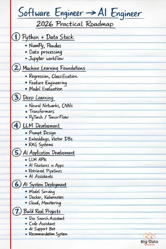
Software Engineer to AI Engineer: 2026 Practical Roadmap
  • ❀ 5
Post #1188 1.53K
πŸ“‰ The Art of the Dashboard: Choosing the Right Chart Type πŸ–Ό

You have clean data, you've tested your hypotheses, and now you need to show your findings. But which chart do you use? A bar chart? A line chart? A pie chart (gulp)?

Choosing the wrong chart can obscure your message or even mislead your audience. Choosing the right one makes your data sing.


1. To Show a Trend Over Time πŸ“ˆ
Best For: Seeing how something changes day-to-day, month-to-month, year-to-year.
Chart Types:
- Line Chart: Classic, great for continuous data. Shows direction.
- Area Chart: Like a line chart, but the area under the line is filled. Good for showing total volume over time.
- Bar Chart (Time Series): Use if you have discrete time periods (e.g., yearly sales) and want to compare exact values.
# Example Use Case: Monthly Website Traffic
# Chart: Line Chart


2. To Compare Categories πŸ“Š
Best For: Showing differences in size or value across distinct groups.
Chart Types:
- Bar Chart (Vertical/Column): Most common. Great for comparing quantities across groups. Easy to read exact values.
- Bar Chart (Horizontal): Better when you have many categories or long category names.
- Grouped Bar Chart: Compares sub-categories within main categories.
- Stacked Bar Chart: Shows total for a category AND how it's made up of sub-categories.
# Example Use Case: Sales per Region
# Chart: Horizontal Bar Chart


3. To Show Composition (Part-to-Whole) πŸ•
Best For: Displaying how a total is divided into parts. Use with caution!
Chart Types:
- Pie Chart: Only use if you have few categories (max 5-6) and you want to show proportions of a whole. The *largest* slice is easiest to read.
- Donut Chart: Similar to pie, but the center is cut out (can sometimes display a total value).
- Stacked Bar Chart (100%): Shows proportions across categories, but as bars, which are often easier to compare than pie slices.
# Example Use Case: Market Share (if only 3 companies)
# Chart: Pie Chart (if few companies) or 100% Stacked Bar

Warning: Humans are bad at comparing slice angles. Bar charts are usually better for precise comparisons.

4. To Show Relationships (Correlation) πŸ”—
Best For: Seeing if two numerical variables are connected and how strongly.
Chart Types:
- Scatter Plot: The go-to. Each dot is an observation, showing the values of two variables. Look for patterns (linear, curved, clusters).
- Bubble Chart: A scatter plot where the size of the "bubble" (dot) represents a third numerical variable.
# Example Use Case: Does Experience correlate with Salary?
# Chart: Scatter Plot


5. To Show Distribution πŸ“¦
Best For: Understanding the range, spread, and central tendency of a single numerical variable.
Chart Types:
- Histogram: Shows frequency counts within bins (ranges) of your data. Great for spotting skewness or multi-modal distributions.
- Box Plot (Whisker Plot): Shows median, quartiles, and potential outliers. Excellent for comparing distributions across categories.
# Example Use Case: Distribution of customer ages
# Chart: Histogram or Box Plot (if comparing age by product)


πŸ’‘ The Ultimate Rule:
Keep it simple. The chart should tell the story quickly. If your audience has to stare at it for five minutes to figure out what's going on, it's not working.


🎯 Today's Goal(What you should do)
βœ”οΈ Know which chart excels at showing trends vs. comparisons vs. relationships.
βœ”οΈ Use bar charts for categories and line charts for time.
βœ”οΈ Be very cautious with pie charts!
βœ”οΈ Use scatter plots to find connections.
  • ❀ 5
Post #1186 1.51K
πŸ’Ž 5 Rare But High-Value Sites for Data Scientists

If you’re tired of the same surface-level tutorials, these five "hidden gems" provide deep technical value you'll refer to for the rest of your career:

1️⃣ Deep Learning Drizzle
A massive, curated database of free, high-quality university courses (Stanford, MIT, CMU) covering every niche in AI and ML.
πŸ”— https://deep-learning-drizzle.github.io/

2️⃣ Distill pub
It uses incredible interactive visualizations to explain complex machine learning research papers that are usually very hard to digest.
πŸ”— https://distill.pub/

3️⃣ Connected Papers
It creates a visual map of how academic papers are linked so you can find the "ancestors" of any specific algorithm.
πŸ”— https://www.connectedpapers.com/

4️⃣ ML-Ops org
While everyone focuses on building models, this site teaches you the "production" side how to actually deploy, monitor, and manage models in the real world.
πŸ”— https://ml-ops.org/

5️⃣ Explained ai
Provides the most intuitive, deep-dive explanations on the internet for how specific algorithms (like Random Forests or Gradient Boosting) actually work under the hood.
πŸ”— https://explained.ai/

Save these for your next deep-work session! πŸš€
  • ❀ 8
  • πŸ‘ 1
Post #1184 1.74K
βš–οΈ Hypothesis Testing & P-values πŸ§‘β€βš–οΈπŸ“Š

You've run an A/B test. Your new website design (Version B) got 12% more clicks than the old one (Version A). Great, right? But is that 12% a real improvement, or just a lucky fluctuation in your data?

This is where Hypothesis Testing and the notorious P-value come in. They help you decide if your observed data is significant enough to make a big decision, or if it's just random chance.


πŸ› The Courtroom Scenario

Imagine a trial:
β€’ Default Assumption (Null Hypothesis, H0): The defendant is NOT GUILTY. (Our designs are the same, the 12% is luck.)
β€’ What We're Trying to Prove (Alternative Hypothesis, H1): The defendant IS GUILTY. (Version B is better than A.)
β€’ The Evidence (Your Data): The 12% difference in clicks.
β€’ The Judge's Decision (P-value): How likely is it that we'd see this "evidence" (12% difference) if the defendant were truly not guilty (designs truly the same)?


1. The Null (H0) & Alternative (H1) Hypotheses

β€’ Null Hypothesis (H0): There is no significant difference between the two groups/variables. (e.g., "New design has no effect on clicks." or "Mean sales for region X is 100.")
β€’ Alternative Hypothesis (H1): There is a significant difference or relationship. (e.g., "New design increases clicks." or "Mean sales for region X is not 100.")

Our goal is usually to reject H0 in favor of H1.


2. The P-value: What It Actually Means

The P-value is the probability of observing data as extreme as (or more extreme than) your current data, assuming the Null Hypothesis is true.

β€’ Small P-value (e.g., 0.01): "It's highly unlikely we'd see this much difference if the new design had no effect. So, we'll reject the null and conclude the new design is better."
β€’ Large P-value (e.g., 0.60): "There's a good chance we'd see this difference just by luck, even if the new design had no real effect. So, we fail to reject the null."


3. The Significance Level (Alpha, Ξ±)

This is your cutoff point. Most commonly, Ξ± = 0.05 (5%).
β€’ P-value ≀ Ξ±: Reject the Null Hypothesis. (Your result is "statistically significant.")
β€’ P-value > Ξ±: Fail to Reject the Null Hypothesis. (Your result is not statistically significant.)


4. The Biggest Misconceptions (DON'T DO THIS!)

β€’ P-value is NOT the probability that H0 is true.
β€’ P-value is NOT the probability that H1 is false.
β€’ A "significant" P-value doesn't mean the effect is large or important in the real world. (A tiny, unimportant difference can be statistically significant if you have a huge dataset.)


🎯 Today's Goal(What you should do)
βœ”οΈ Formulate clear Null and Alternative Hypotheses.
βœ”οΈ Understand the P-value as the likelihood of seeing your data if the Null were true.
βœ”οΈ Use a significance level (alpha) to make decisions.
βœ”οΈ AVOID common P-value misinterpretations!

πŸ‘‰ P-values don't tell you if your hypothesis is true, but they do tell you if your data makes the Null Hypothesis look very, very unlikely.
  • ❀ 3
  • πŸ‘ 3
  • πŸ‘ 1
Post #1183 1.57K
How to Choose Your ML Research Topic: Step by Step Framework
  • ❀ 7
Older posts β†’
Threads Profile ViewerView any public Threads profile without an account.Open ThreadLook β†’Writing with AI? Make it sound human.Metric37 rewrites AI drafts so they read naturally. Free AI detector, 1,500 words free.Try Metric37 β†’