


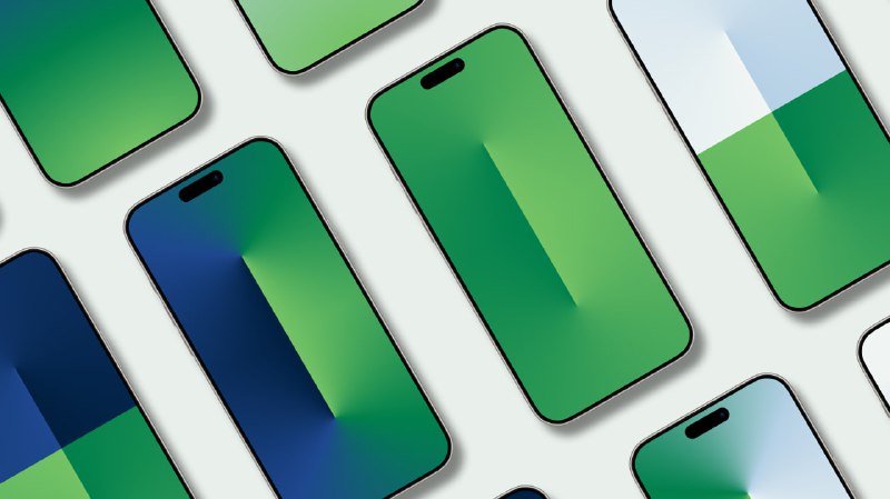
🎨 This set is about color in practice: how different tones interact, 🔝 how gradients hold attention, 🎲 and how a screen can feel either energetic or calm depending on the balance 🎯
📱 With dynamic wallpaper switching enabled, these wallpapers reveal new moods throughout the day, making the screen feel fresh without being distracting.
🔡he visual approach and color language here are inspired by existing digital aesthetics — not claimed as invented from scratch. 🔡he work lies in interpretation, selection, and execution ⚪️ taking familiar ideas and translating them through my own sense of balance and rhythm.
The collection includes 9 wallpapers, split into two clear directions.
🎄 4 unusual wallpapers built from multiple colors:
⚪️Here, color works in dialogue — contrasts push against each other, tones overlap, and gradients create depth 😀
⚪️These wallpapers feel more expressive and dynamic, designed to change the mood of the screen rather than just decorate it.
⚖️ 5 static wallpapers based on one main gradient explored in different states:
⚪️The same color idea appears in bright, dark, and lighter variations, showing its different sides
⚪️Calmer, more stable, and easier on the eye — perfect for everyday use.
Each wallpaper was created manually, with attention to transitions, proportions, and how the colors sit on a real device screen.
#wallpapers #gradients #colorstudy
🏳️ @Desliner | Boost link